Book Covers and Designs
It's been a busy month for me, in the graphic design department. I've had the pleasure of creating several book covers, in different genres, for clients. I always enjoy this sort of work, from the research into the specific genre covers so I'm sure my work best suits the marketplace, to matching up with author expectations on the art. It's not always an easy process, but sometimes it all falls into place.

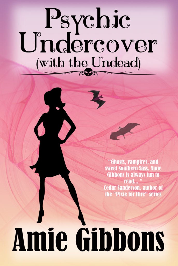
Amie's cover was developed when she and I were talking about genre conventions and I ran a quick mock-up to show her what I was thinking, because sometimes a picture really does work better than a thousand words.
Much like writing, I find that the longest part of the process is the thinking part. Once I have a mental image, the rest of it flows fairly quickly these days - which is a big change from where I started. I'd spend hours photobashing before I started to get comfortable with my tools. Practice really does help in any skill.

Leo's cover art was a serious challenge, because he needed something specific. I wound up creating and modifying more elements for it than usual, but in the end we were both happy with it.
This is the second cover I've done for the Legion series. One of the earliest covers I did for someone else, the first Legion book shows how much my style has matured and changed since I started doing this. And I do have a style, I know it. I'd like to think it's not so obviously 'Cedar' that you can look at one and peg it, but as with any art form, the artist's voice will come through.

Jason's book isn't out yet, but he needed a pure science fiction cover. The original design contained an element that didn't fit, so it took some time to work out a better version.
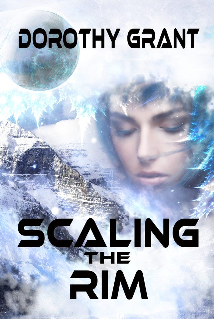
One of the common misconceptions about book covers is that they should slavishly recreate a scene from the book. Actually, they usually shouldn't, and it's rare to see that well-done and have it be effective. Covers are a marketing tool, and as such they need to convey the whole of the book, not a single scene. The cover below needs to convey planetary romance, a sub-genre of Space Opera and science fiction. By making the woman's face prominent, we signal that there are girl cooties inside, as it were. Which will hopefully head off readers who don't like romance touching their SF.

Another book that isn't released yet, and the cover isn't final, either. Most covers have a title, author name, and a pull quote or other text element.
Now that I've talked about my work... I have done more than a few posts on doing your own cover art and design. Even if you never plan to do it yourself, knowing what your cover ought to have for elements, well-laid-out art, and fonts is important when you're working with a designer. The Indie Authors I work with can't always afford to have someone else do it, so I try to make enough resources available to get them started if they do want to DIY. And I'm happy to answer questions when you get stuck, too. It's not taking money out of my pocket, and everyone starts somewhere.
If you do want to talk pricing and cover work, give me an email or hit the contact page in the menu bar.


