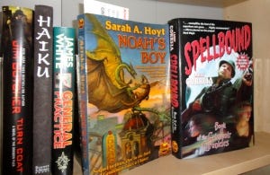
Cover-up Follow-Up

Beautiful bespoke cover art. Baen is almost the only House still doing this.
Cross-posted over at Amazing Stories
Last week I showed some examples of good and bad cover art. Now, if you are an indie author, or a small press publisher, you can't afford a great cover artist to create bespoke art for your cover. And I'll tell you something: most traditional publishers don't bother, either. You will find covers that came from one of the sources I have listed below on them, or even no art at all - an icon, or simply the author's name and a small blurb.
Nonetheless, you can hire an artist if you want. The trouble will be finding one that is reliable. I have friends who have gone through several without every seeing their art. I myself waited a year for an artist to finally get around to sending me what I had commissioned. If you find an affordable, reliable artist, treat them like a jewel and hold onto them - I'm given to understand they are rarer than hen's teeth. I am working with one myself, right now, and if he wants I will give out his information when I can show off my cover art for Pixie Noir. I have found, as have others, that artists on Deviantart might have pretty portfolios, but most likely they won't even respond to messages, and again, you have no way of knowing if they can deliver on deadline.
The next step is to learn the basics of layout yourself, which can be done using a free program like Gimp, just as well as in the much more expensive inDesign or Photoshop. For art, either buy low-cost images from Dreamstime, or search for creative commons images in places like Creative Commons itself, even places like this for copyright-free NASA images, perfect for SF stories. With any site, whether you grab a free image or pay for one, you need to give credit where credit is due. Also, make sure you check the licensing for the image, as some are free only for non-commercial purposes.
I can't find an image that fits a scene in my book, now what? Well, you don't need to have an image that perfectly fits your book. What you need is an evocative image, not too cluttered or busy, that captures the feeling of your genre, be it fantasy, science fiction, or beyond. Your readers make their first impression on this image. Resist the temptation to create a blurry, pixelated piece of amateur art and slap that on your cover. It will look bad, and it will put readers off your book. Far better to go simple, elegant, and classic than to put hours into art if you do not already have the training to create it. Keep in mind that science fiction covers are never photographs. There are ways to digitze photos into artistic looks, and if you have the training, this may be the way to go for you. Fantasy is also never a photo-cover genre. however, you can play a little more fast and loose with the art, to suit your part of the genre. Epic fantasy has different cover styles than urban fantasy, and so forth. Don't put a pretty unicorn on your tough, sexy, werewolf story unless you want bad reviews and disgusted readers.
It's an art form all itself, covering your books. And be prepared for the boundaries to shift, and in a year, to possibly be re-covering your books again. Like the art of writing, you never stop learning in this business. Just do one thing… make your name big! Really big, covering the span of the cover. It might look like too much to you, but keep in mind that your reader sees this cover in thumbnail for the first time, and you want your reader to remember your name. It's called branding, and I will talk about that next week.


