Creating a Romance Cover
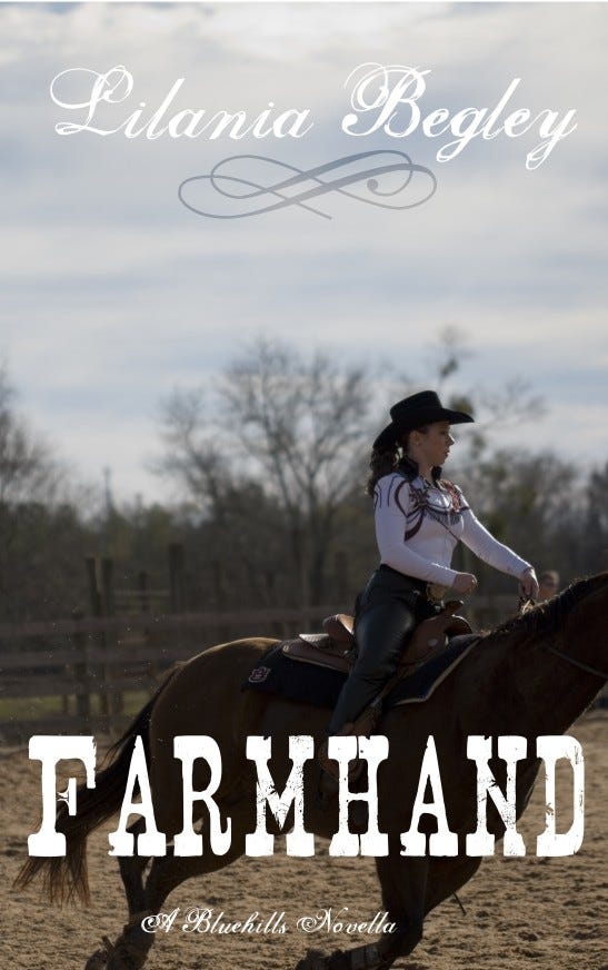
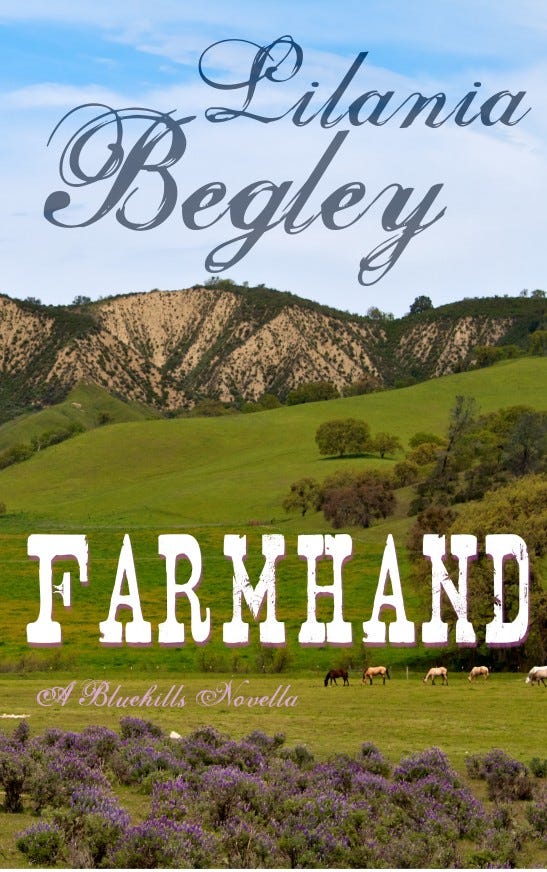
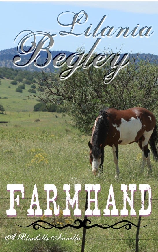
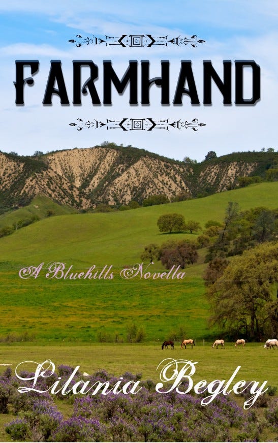
As I'm finishing up with tweaks and additions to Farmhand, it's time to face the other big chore that goes under my Publisher's Hat (for this book, a ten-gallon stetson I think). I'm putting a cover together. Designing a cover for any genre takes many things and rolls them all up into one 4500x2800 pixel package. I need to cue the specific sub-genre (Western Romance, sweet, modern), and I need to align loosely with the popular books in that sub-genre. I'm seeing photographs, which is great, although I would also consider an oil-painting effect as long as it wasn't too loose (think L'Amour covers). The fonts are more fancy, even girly, which makes me happy.
I chose title fonts that remind me of the L'Amour covers I referenced above, and for the author's name, a really nice swirly handwriting font. Below you'll find several versions, more than I would normally make, but these will go into my portfolio, as well, if anyone is looking for a cover designer who can branch out into new genres at the drop of a hat. That's a big hat.
Which one do you prefer? Which one makes you want to look inside?


